2016
DIOR
FLAGSHIP STORE
MIAMI
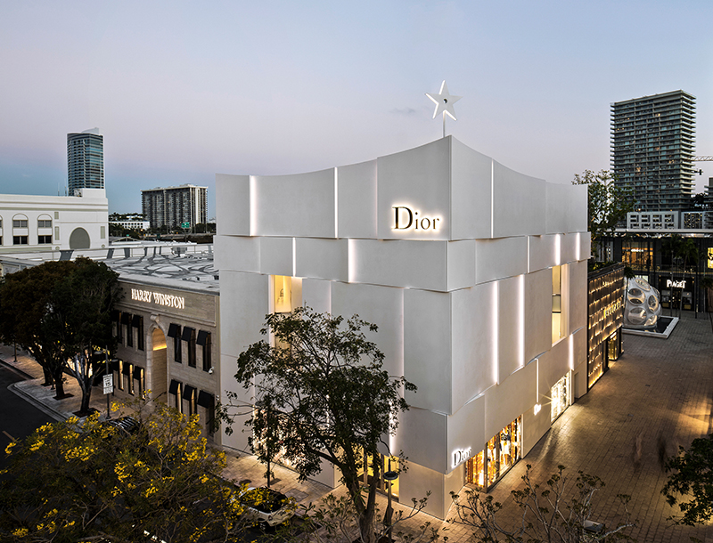
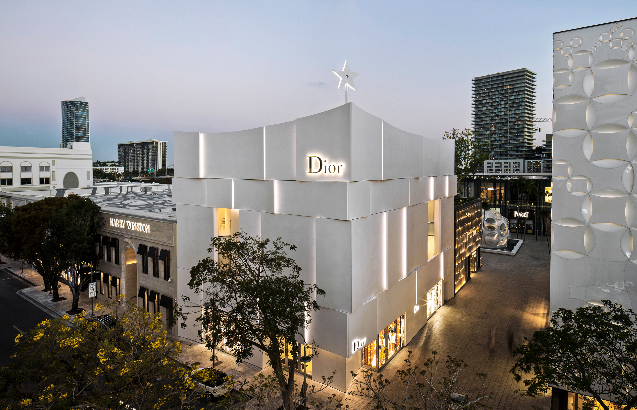
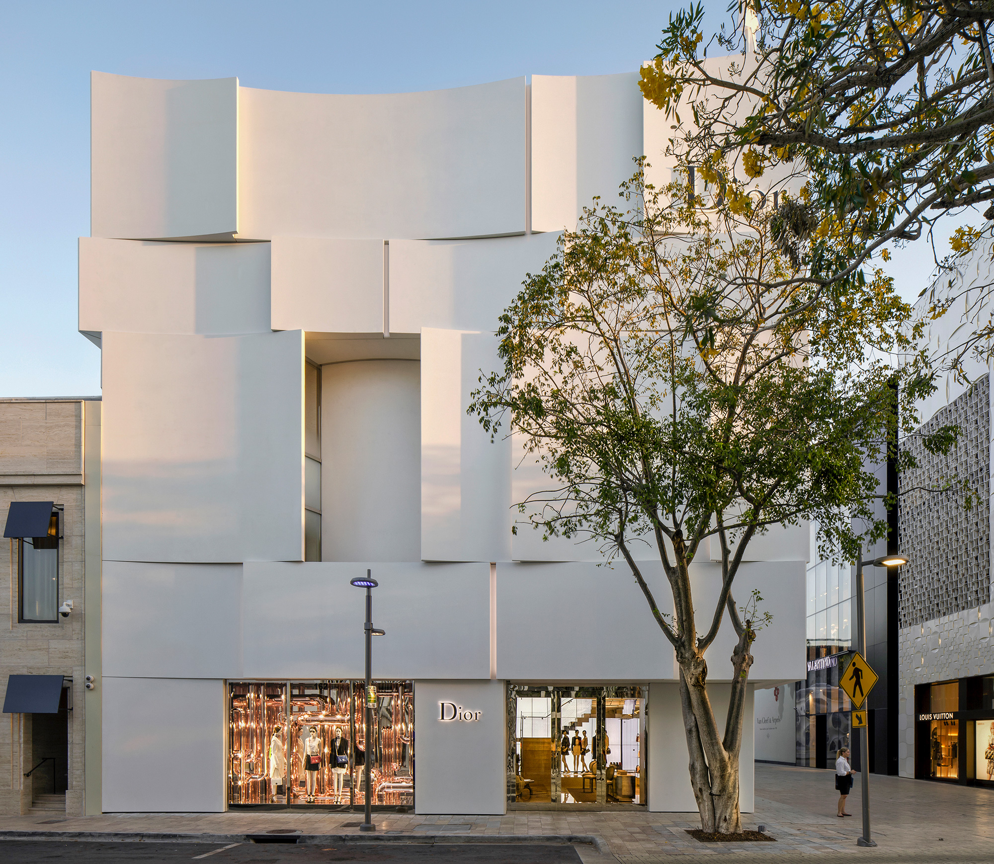
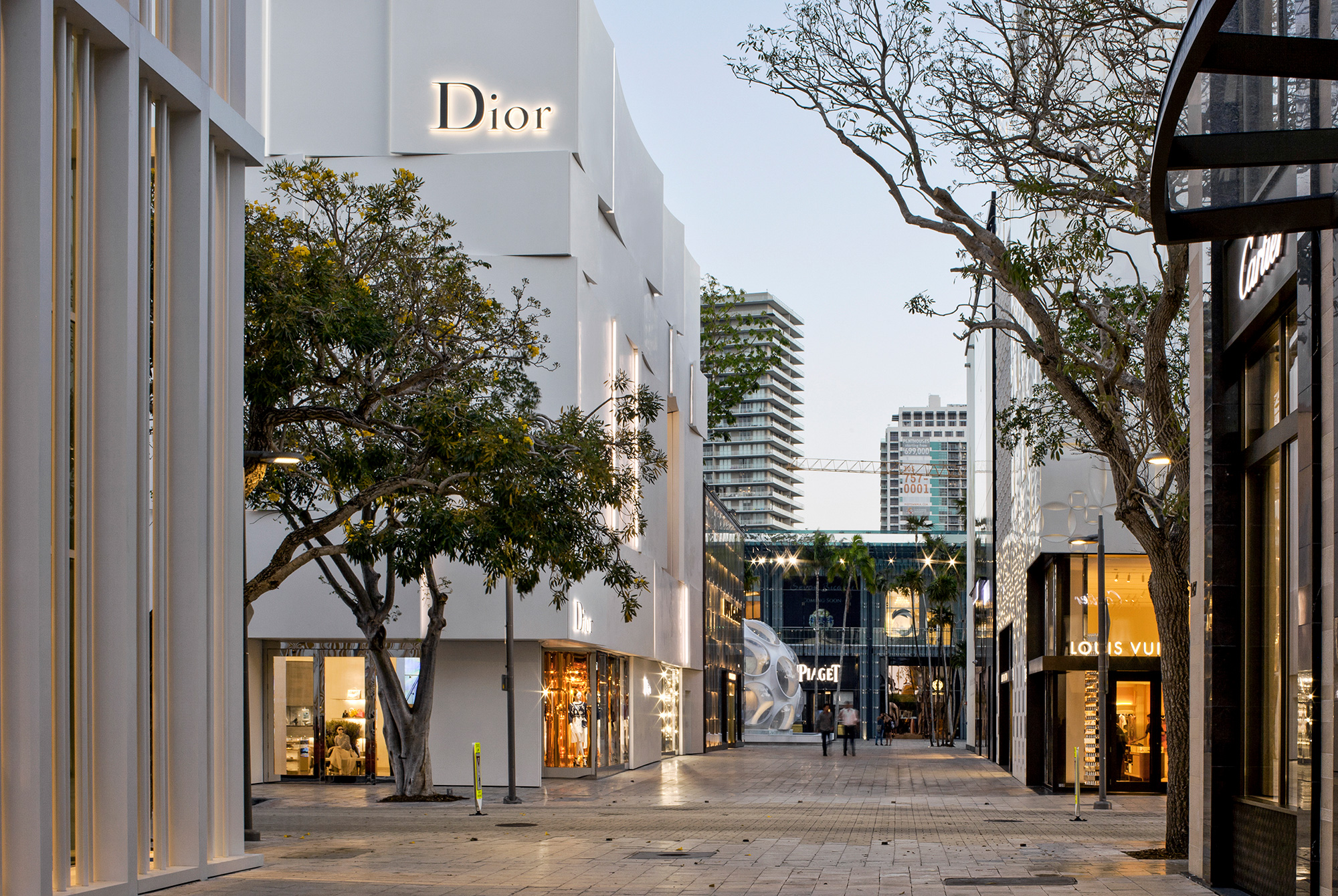
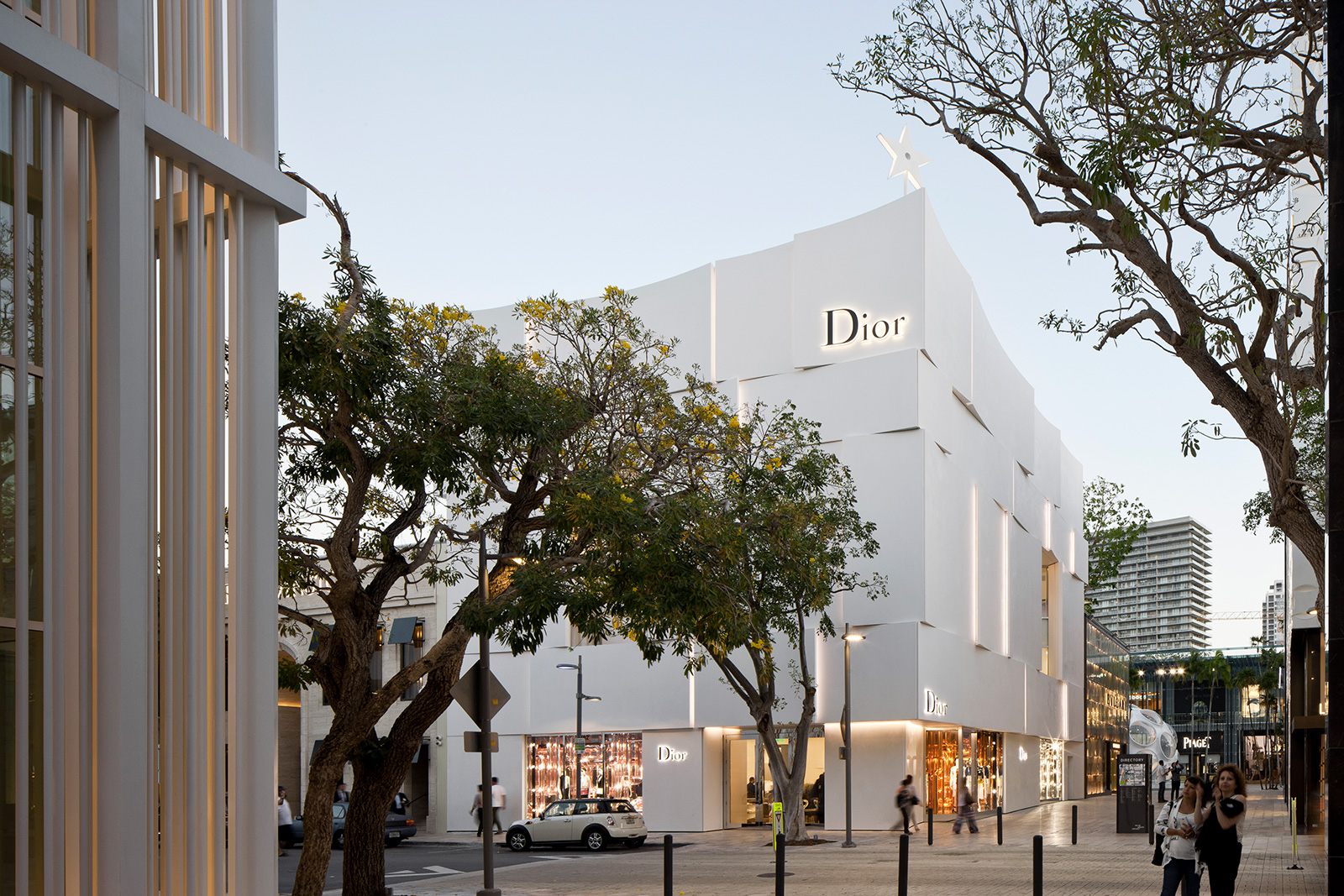
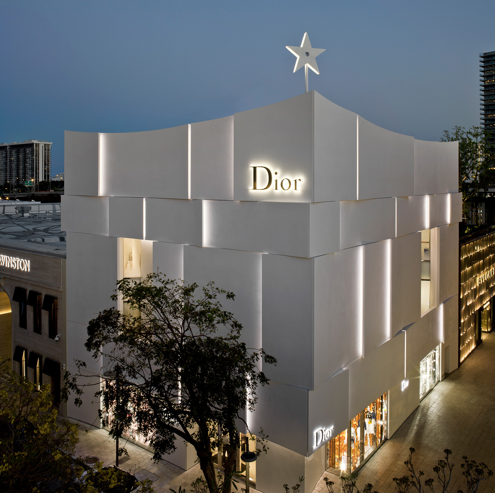
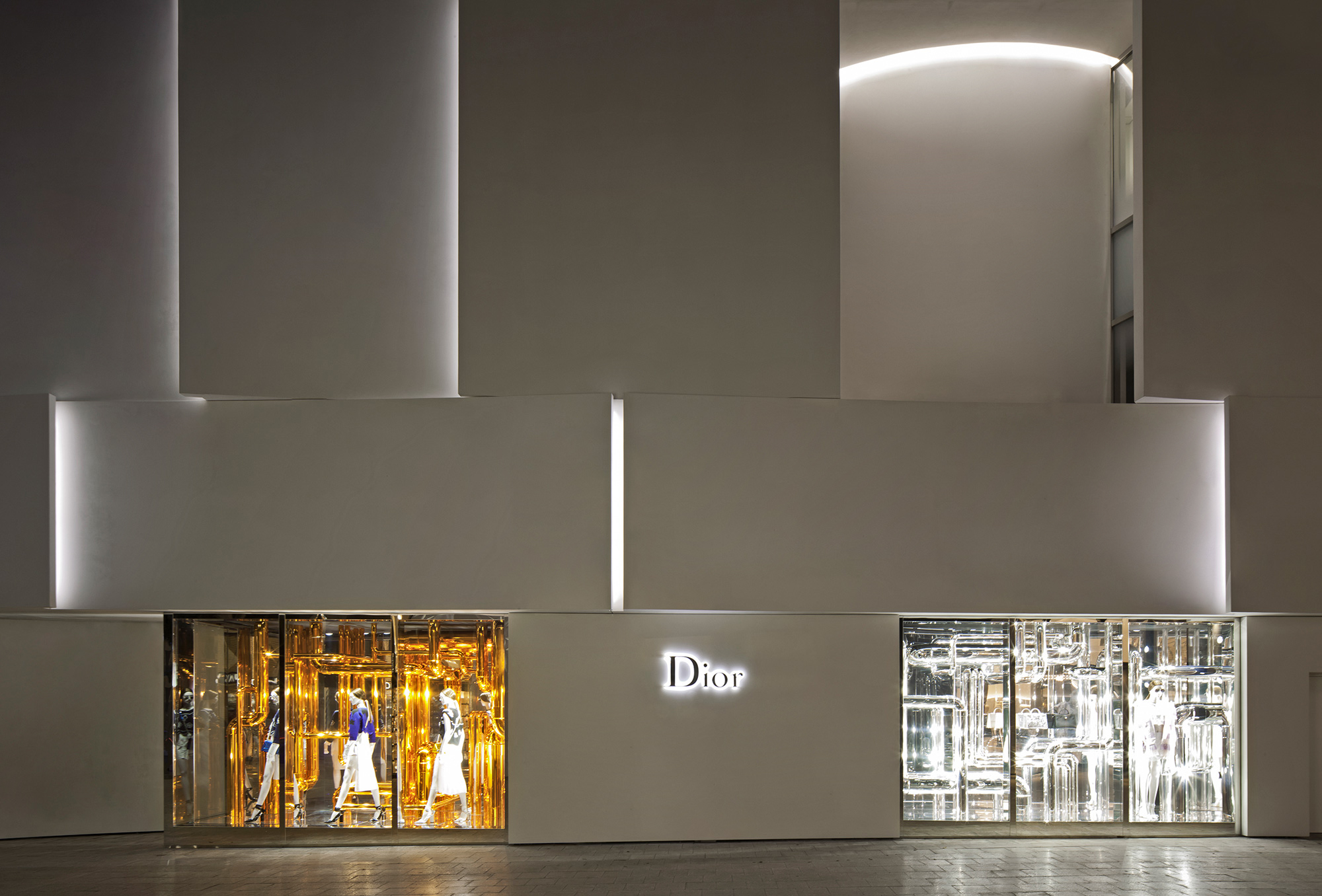
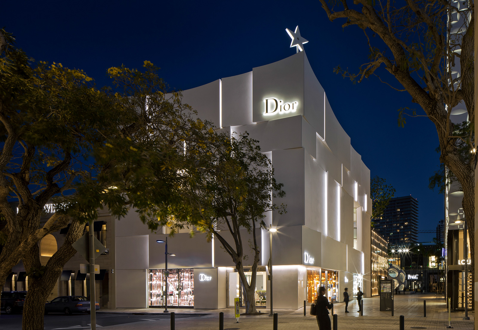
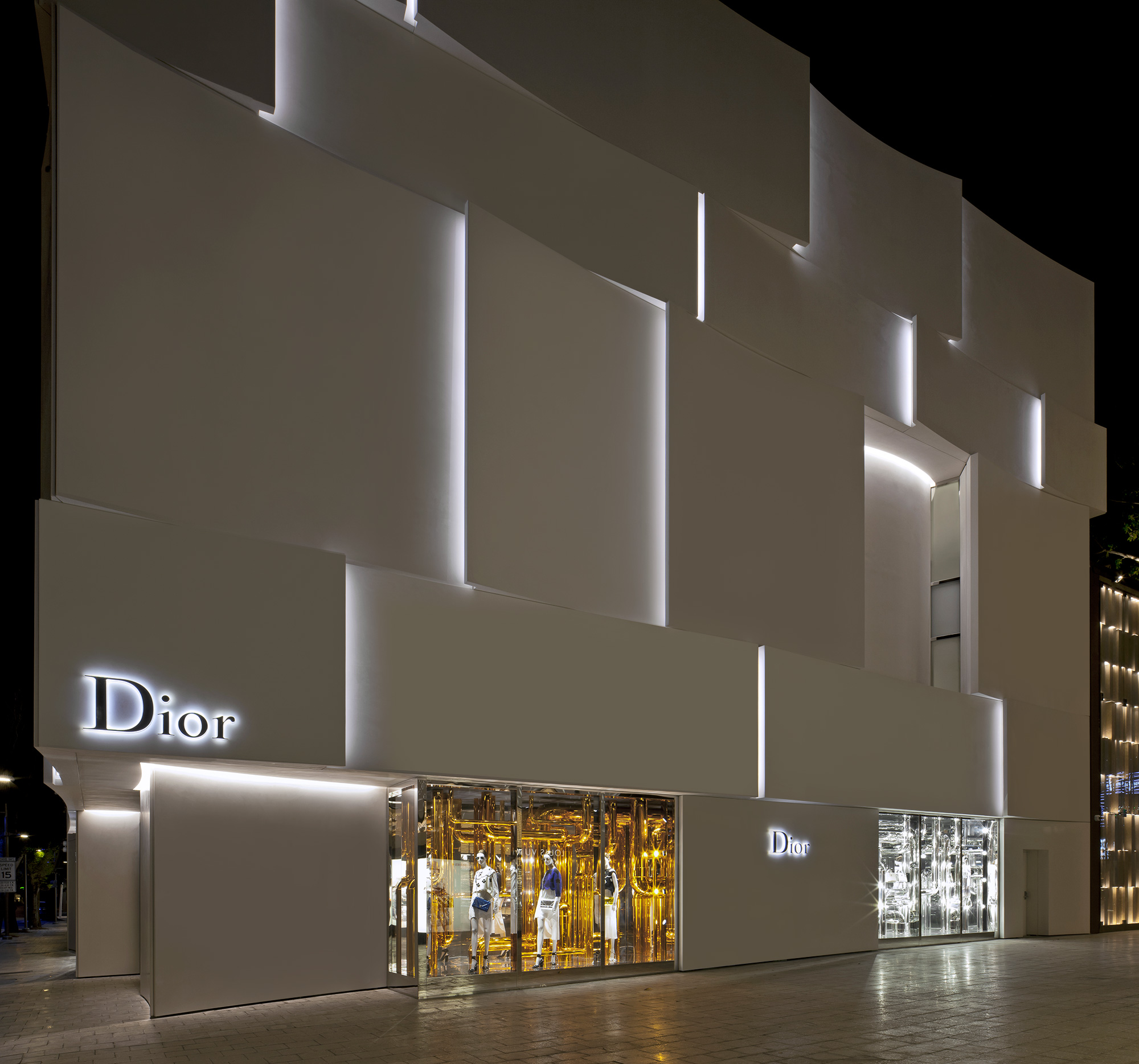
In the pulsing and dynamic Miami Design District, Dior arrives with its new sculpted white assembly with a subtle facade lighting project, provoking curiosity due to its absence of transparency, while at the same time evoking elegance and seemingly effortless playfulness.
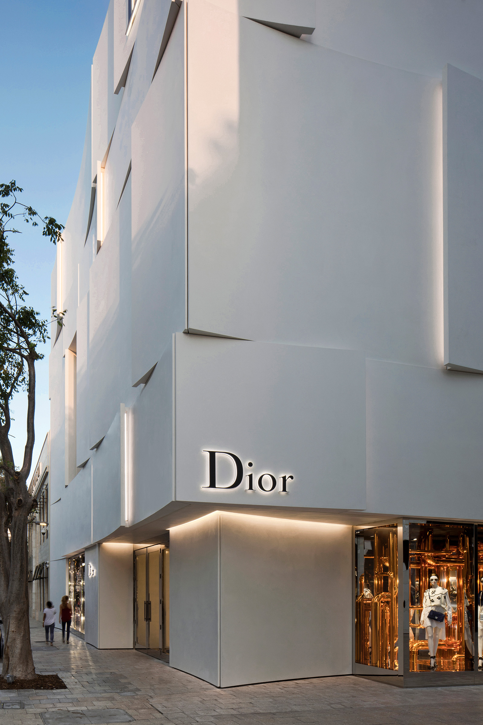
Behind this Dior Facade original project, we find the Barbarito Bancel French studio who getting inspired from the figurative ‘’plissé’’ style of various Dior creations, introduced this very shape on the building’s skin, not only as cladding, but involving at large the skin of the building.
The core of the store is wrapped within white curved panels made of ultra-high-performance concrete and marble powder overlapping each other and changing verses from floor to floor.
Collaborating between architect and lighting designer on the Dior Miami Facade had been very close since the beginning, and each solution suggested by the architect had to become a full scale mockup with light integrated in order to have a full idea of the final result.
Light accompannied different textures, finishings and movement of light.
After several sketches and tests, and when the design was finalized the final mockup was made in order to test the proper integration of the light inside the pleats, the uniformity and the visibility of the lighting fixtures, and the sequence of the mounting of the fixtures.
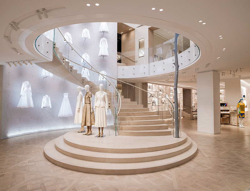
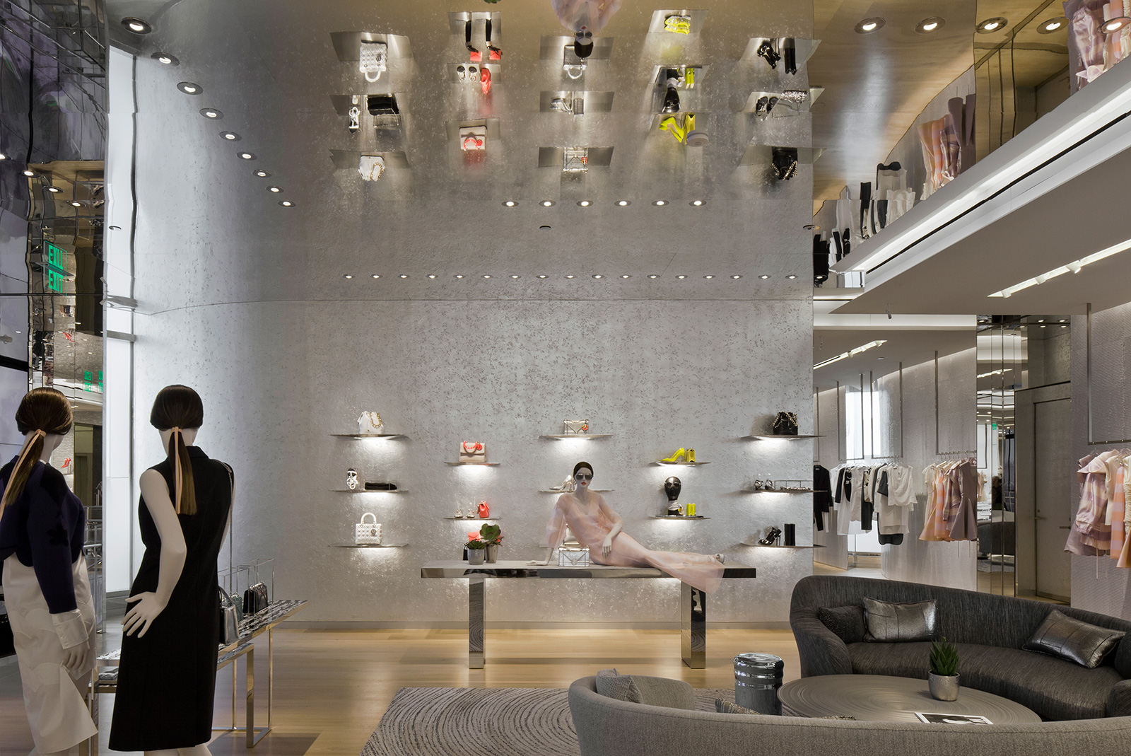
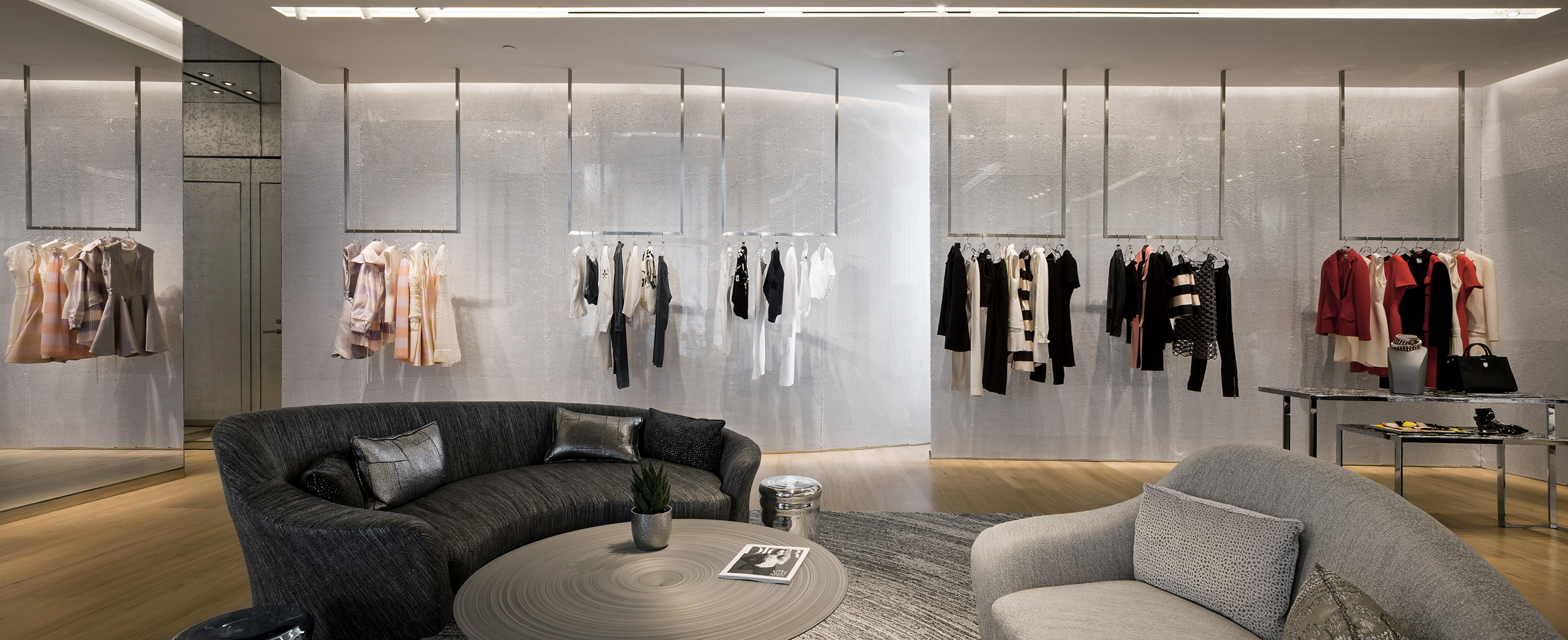
While the light follows the eery pleats of this haute couture architectural garment, the sinuosity of the outside almost competes with the sinuosity of the garments contained inside the architecture itself.
Dior Miami Facade had been a unique architectural feature and got awarded in various fields.
Awards
FACADE American architecture prize 2016
Silver prize commercial architecture category
RELATED PROJECTS Peter Marino Architects
RELATED PROJECTS Barbarito Bancel

